Hologram UI
3/28/2024
Veneta Kochovska
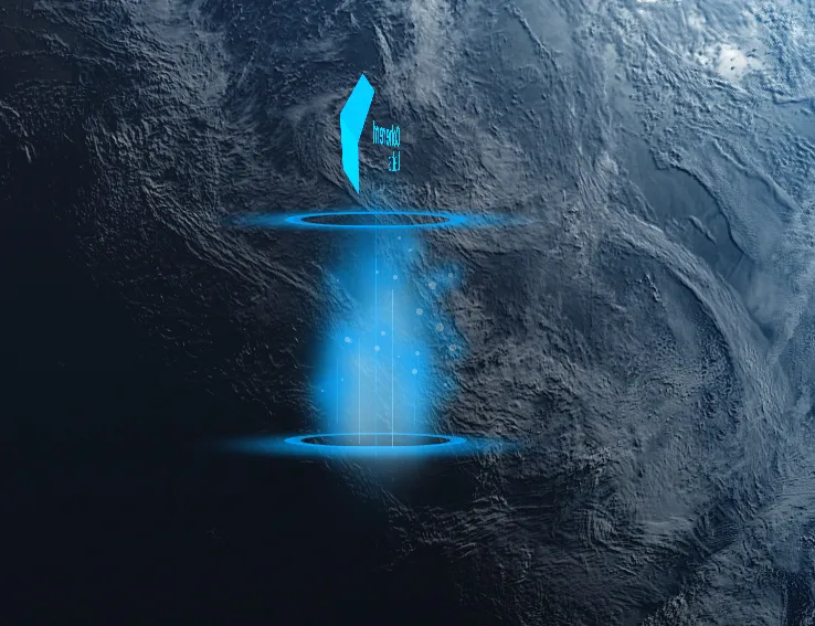
This guide shows how to create a hologram effect like this one in Gameface:
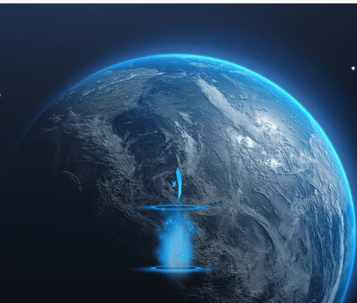
It uses CSS transform , filters , animations and box-shadow to achieve the glowing, transparent look with the moving particles.
The skewed circles are SVGs that have transform applied to them:
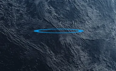
1<svg width="200" height="200" class="ellipse">2 <ellipse cx="100" cy="100" rx="75" ry="60" style="stroke:#00a6ffcc;stroke-width:15;"3 fill-opacity="0"></ellipse>4</svg>The .ellipse class has rotate3d :
1.ellipse {2 transform: rotate3d(1, 0, 0, 84deg);3}The shadow underneath the ellipses are div elements with box-shadow:
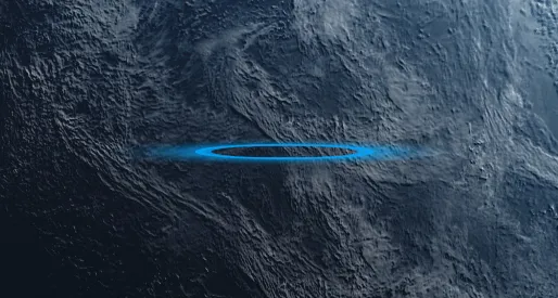
1.projector-circle-bottom {2 position: absolute;3 top: 439px;4 width: 150px;5 height: 120px;6 border: 2px transparent;7 border-radius: 150px;8 box-shadow: 0px 50px 100px 30px #00a6ffcc;9}And they too have the .ellipse class which applies the transformation.
The light beams are absolutely positioned div elements that have box-shadow which creates the specific glow transparent effect:
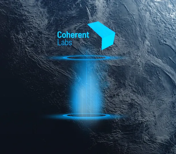
To achieve pointy edges we use four vertically aligned elements that have different values for blur and spread-radius :
1<div class="light-beam">2 <div class="glow-edge"></div>3 <div class="glow-middle"></div>4 <div class="glow-middle"></div>5 <div class="glow-edge"></div>6</div>glow-middle has higher value for blur-radius giving it a bigger shadow, making the center of the light beam wider. And respectively glow-edge has a narrower shadow.
1.glow-edge {2    width: 1px;3    height: 60px;4    background-color: rgb(0, 166, 255, 0.5);5    box-shadow: 0px 0px 55px 10px rgb(0, 166, 255, 0.5);6}7
8.glow-middle {9    width: 1px;10    height: 60px;11    background-color: rgb(0, 166, 255);12    box-shadow: 0px 0px 80px 20px rgb(0, 166, 255, 1);13}
The slightly lighter light beams have separate class .highlight that uses different color for the box shadow:
1.highlight .glow-edge {2 background-color: rgb(129, 222, 255, 1);3 box-shadow: 0px 0px 100px 20px rgb(230, 249, 254, 0.7);4}The image is an SVG with the logo that uses a CSS filter to change the color:
1.hologram-bg {2 background: url(./assets/Master_full_white.svg);3 background-repeat: no-repeat;4 background-size: contain;5 filter: invert(29%) sepia(66%) saturate(1878%) hue-rotate(175deg);6}The particle effects are generated using JavaScript and animated using CSS animation. Each particle has box-shadow that adds the glow effect:
The generateParticles(count, diameterBoundaries, coordBoundaries) accepts 3 arguments:
- the number of particles you want to generate
- an array of lower and upper limit of the diameter
- an array of lower and upper limit of the position coordinates
Example:
1generateParticles(20, [2, 8], [150, 150]);Will generate 20 particles with random size ranging from 2 to 8 pixels and will position them with top and left randomly chosen, not exceeding 150.
1.particle {2 background-color: rgba(208, 235, 250, 0.5);3 box-shadow: 0px 0px 20px 10px rgb(0, 166, 255, 0.5);4}The size of the particles is dynamic but within a given range. The position is also random, but again - within the boundaries of a container element. Each particle is a square div with border radius equal to its width to make it a circle. The animation is a vertical movement from the starting position to the top of the parent container:
1function generateParticleAnimation(initialPosition, idx, animClassName) {2    const animName = `particle-anim-${idx}`;3
4    return `5    .${animClassName} {6        animation-duration: 6s;7        animation-name: ${animName};8        animation-iteration-count: infinite;9        animation-timing-function: linear;10    }11    @keyframes ${animName} {12        0% {13            top: ${initialPosition}px;14            opacity: 1;15        }16        50% {17            top: 10px;18            opacity: 0;19        }20        100% {21            top: ${initialPosition}px;22            opacity: 1;23        }24    }`;25}