Gameface UI Update: Menu Glow-Up + Quick Component Customization Guide
8/28/2025
Martin Bozhilov
In the latest update GameFace UI ships a refreshed Menu UI that highlights our newest components out of the box.
What’s new in the Menu
The new UI for the menu view now showcases the following components:
- Scroll - The scroll component is great for display long menu options lists while preserving a defined structured, without overflow.
- Tabs - The tabs component is perfect for organizing content into separate views, making it easy for users to navigate between different sections of the menu.
- Modal - The modal component is used for displaying important information or actions that require user attention, such as confirming changes before navigating away from a tab.
- Segment - The segment component is ideal for selecting between multiple options in a compact and visually appealing way, such as choosing keybind presets.
- Dropdown - The dropdown component is useful for selecting from a list of options without taking up too much space in the UI, such as selecting resolution, graphics quality or a language.
- Stepper - The stepper component is great for incrementing or decrementing values in a controlled manner, such as adjusting the difficulty level of a game.
- ToggleButton - The toggle button component is perfect for enabling or disabling settings with a simple switch, such as turning on/off fullscreen mode or VSync.
- Slider - The slider component is ideal for selecting a value within a range, such as adjusting mouse sensitivity or field of view.
- TextSlider - The text slider component is useful for selecting from a list of predefined options in a visually appealing way, in our case we used it for subtitle size selection.
- NumberInput - The number input component is great for entering numerical values directly, such as setting a custom frame rate limit.
- Checkbox - The checkbox component is perfect for toggling options such as enabling/disabling various accessibility features.
- List - The list component is useful for displaying a list of items in a structured manner. It has a wide veriety of use cases, in our case we used it to display additional information about the settings and on the end credits.
- ColorPicker - The color picker component is ideal for selecting colors in a user-friendly way, such as customizing the crosshair color.
The complete Menu UI is located at src/views/menu/Menu.tsx in your Gameface UI project.
To preview it, run npm run dev and open the Player at localhost:3000/menu.
All components in the menu have been styled to match the new UI.
You’ll find these customized components in src/custom-components/Menu/.
Next, let’s explore how some of these components were tailored and how their features help create an interactive menu experience!
Component Customization
Since most components will be reused across the UI, it’s better to wrap them into custom components. This allows you to centralize styling, define common behavior, and keep consistency.
Slider
Let’s walk through how to take the base Slider and adapt it for our minimalistic design.
Step 1 — Creating the wrapper
We’ll start by creating CustomSlider in custom-components/CustomSlider/CustomSlider.tsx.
The idea: place the slider value next to the slider using Flex for layout.
1import Slider from "@components/Basic/Slider/Slider"2import Block from "@components/Layout/Block/Block";3import Flex from "@components/Layout/Flex/Flex";4
5const CustomSlider = () => {6    return (7        <Flex align-items="center">8            <Block>{3}</Block>9            <Slider10                step={0.1}11                min={1}12                max={10}13                value={3}14            />15        </Flex>16    )17}18
19export default CustomSlider;
Step 2 — Styling
Next, define the component’s slot we will modify and wire them up for styling with classes.
3 collapsed lines
1import Slider from "@components/Basic/Slider/Slider"2import Block from "@components/Layout/Block/Block";3import Flex from "@components/Layout/Flex/Flex";4import style from './CustomSlider.module.scss';5
6const CustomSlider = () => {7 return (8 <Flex align-items="center" class={style.wrapper}>9 <Block class={style['value-preview']}>{3}</Block>10 <Slider11 step={0.1}12 min={1}13 max={10}14 value={3}15 class={style.slider}>16 <Slider.Handle class={style['slider-handle']}></Slider.Handle>17 <Slider.Fill class={style['slider-fill']}></Slider.Fill>18 <Slider.Track class={style['slider-track']}></Slider.Track>19 </Slider>20 </Flex>21 )22}23
24export default CustomSlider;With the classes wired up, we will now add some CSS to create our desired look. The changes we will make to the component are simple: new colors, hover state, removing the rounding and hiding the handle.
1.wrapper {2    width: 15vmax;3}4
5.value-preview {6    border: 0.2vh solid $primaryColor;7    width: 2.5vmax;8    padding: 0.5vmax 0;9    margin-right: 2vmax;10    text-align: center;11}12
13.slider {14    margin: 0;15    width: 10vmax;16    height: 1vmax;17
18    &-handle {19        visibility: hidden;20        padding: 1vmax;21    }22
23    &-track {24        background-color: $background-soft;25    }26
27    &-track,28    &-fill {29        border-radius: 0;30    }31
32    &-track {33        background-color: $background-soft;34
35        &:hover {36            background-color: $background-soft-hover;37        }38    }39}
Tip: use visibility: hidden instead of display: none for the handle. Otherwise, the slider won’t register drag/click events.
Tip: Add some padding to the hidden element to increace its area - making it easier to click and interact with.
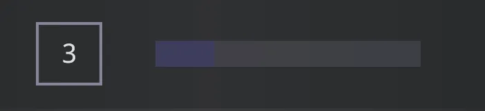
With these changes our slider shoud look like this:
Step 3 — Making it functional
The final step is to make our slider interactive by binding its value to the Block component that displays it.
The process is straightforward and already covered in detail in our documentation .
In short, we need to:
-
Create a signal to store the current slider value.
-
Pass a callback to the slider’s
onChangeprop. -
Update the signal inside that callback so the
Blockalways shows the latest value.
This setup ensures the UI is reactive - whenever the slider moves, the displayed value updates instantly.
4 collapsed lines
1import Slider from "@components/Basic/Slider/Slider"2import Block from "@components/Layout/Block/Block";3import Flex from "@components/Layout/Flex/Flex";4import style from './CustomSlider.module.scss';5import { createSignal } from "solid-js";6import { emitChange } from "../../../views/menu/util";7
8const CustomSlider = () => {9 const [value, setValue] = createSignal(3);10 const handleChange = (newValue: number) => {11 setValue(newValue)12 emitChange()13 }14
15 return (16 <Flex align-items="center" class={style.wrapper}>17 <Block class={style['value-preview']}>{value()}</Block>18 <Slider19 onChange={handleChange}20 step={0.1}21 min={1}22 max={10}23 value={value()}24 class={style.slider}>25 <Slider.Handle class={style['slider-handle']}></Slider.Handle>26 <Slider.Fill class={style['slider-fill']}></Slider.Fill>27 <Slider.Track class={style['slider-track']}></Slider.Track>28 </Slider>29 </Flex>30 )31}32
33export default CustomSlider;The benefit of having a handler passed to the onChange is that we can run additional logic when the value changes.
In our case we need to call a emitChange function which will just let us know if changes have been made to the UI
(we use it to display a modal when the tab is about to change).
Step 4 — Making it reusable
If you plan to use the component just once in your UI you can leave it like that and hard-code the values but in our case we need this slider in a lot of places across the UI.
To achieve reusability we will add props to the CustomSlider which will need to be passed when it is initialized.
7 collapsed lines
1import Slider from "@components/Basic/Slider/Slider"2import Block from "@components/Layout/Block/Block";3import Flex from "@components/Layout/Flex/Flex";4import style from './CustomSlider.module.scss';5import { createSignal } from "solid-js";6import { emitChange } from "../../../views/menu/util";7
8interface CustomSliderProps {9 step: number;10 min: number;11 max: number;12 value: number;13 onChange?: (value: number) => void;14}15
16const CustomSlider = (props: CustomSliderProps) => {17 const [value, setValue] = createSignal(props.value);18 const handleChange = (newValue: number) => {19 setValue(newValue)20 emitChange()21 }22
23 return (24 <Flex align-items="center" class={style.wrapper}>25 <Block class={style['value-preview']}>{value()}</Block>26 <Slider27 onChange={handleChange}28 step={props.step}29 min={props.min}30 max={props.max}31 value={value()}32 class={style.slider}>33 <Slider.Handle class={style['slider-handle']}></Slider.Handle>34 <Slider.Fill class={style['slider-fill']}></Slider.Fill>35 <Slider.Track class={style['slider-track']}></Slider.Track>36 </Slider>37 </Flex>38 )39}40
41export default CustomSlider;With this setup our custom slider can be modified however we see fit for the UI. This is how the CustomSlider will need to be initialized:
1<MenuItem id="fov" name='Field of view'>2 <CustomSlider min={1} max={10} step={0.1} value={3.5} />3</MenuItem>4<MenuItem id="mouseSensitivity" name='Mouse sensitivity'>5 <CustomSlider step={0.1} min={1} max={10} value={3.3} />6</MenuItem>Segment
The process of customizing the Segment component follows the same principle as with the Slider:
wrap the base component, style its slots, and extend it with props to make it reusable.
Here’s a simplified CustomSegment implementation:
1import Segment from "@components/Basic/Segment/Segment"2import { For } from "solid-js";3import style from './CustomSegment.module.scss';4import { emitChange } from "../../../views/menu/util";5
6type CustomSegmentProps<V extends readonly string[]> = {7    values: V;8    default: V[number];9    'custom-class'?: string;10    onChange?: (v: V[number]) => void;11    ref?: any;12};13
14export function CustomSegment<V extends readonly string[]>(props: CustomSegmentProps<V>) {15    const handleChange = (val: V[number]) => {16        emitChange()17        props.onChange?.(val);18    };19
20    return (21        <Segment ref={props.ref} onChange={handleChange} class={`${style.segment} ${props["custom-class"] ?? null}`} >22            <For each={props.values}>23                {(v) => <Segment.Button24                    class={style['segment-button']}25                    class-selected={style['segment-button-selected']}26                    selected={v === props.default}27                    value={v}>{v}</Segment.Button>}28            </For>29            <Segment.Indicator class={style['segment-indicator']} />30        </Segment>31    )32}33
34export default CustomSegment;
The component styling:
1.segment {2    background-color: $background-soft;3    width: 20vmax;4
5    &-button {6        flex: 1;7        justify-content: center;8        background-color: transparent;9        color: $disabledColor;10        text-transform: capitalize;11
12        &:hover {13            color: $textColor;14            background-color: $background-soft-hover;15        }16
17        &-selected {18            color: $textColor;19
20            &:hover {21                background-color: transparent;22            }23        }24    }25
26    &-button::before {27        box-shadow: none !important;28    }29
30    &-button::after {31        background-color: $background-soft;32    }33}
Using TypeScript for Autocomplete
Notice how we have made our CustomSegment component is defined as a
generic function :
1export function CustomSegment<V extends readonly string[]>(props: CustomSegmentProps<V>) {This lets us combine generics + tuple types to make the component fully type-safe and autocomplete-friendly.
By declaring the values prop as a readonly string[], TypeScript can infer valid options for you.
The only requirement is to declare your options with the as const assertion:
1const OPTIONS = ['PC', 'Tactical', 'Left-Handed', 'Custom'] as const;2
3<MenuItem id="keybindPreset" name="Keybind Preset">4    <CustomSegment5        ref={segmentRef}6        values={OPTIONS}7        default="PC"8        onChange={(v) => setPreset(PRESETS[v])}9    />10</MenuItem>
Now, onChange will only accept "PC" | "Tactical" | "Left-Handed" | "Custom" — preventing typos and giving you IDE autocomplete for free.